

TABLEAU PROJECT
NECP Tracker: Climate Progress, Made Clear
An end-to-end Tableau project that turned fragmented country-level Excel files into an interactive climate and energy dashboard across 12 European countries.
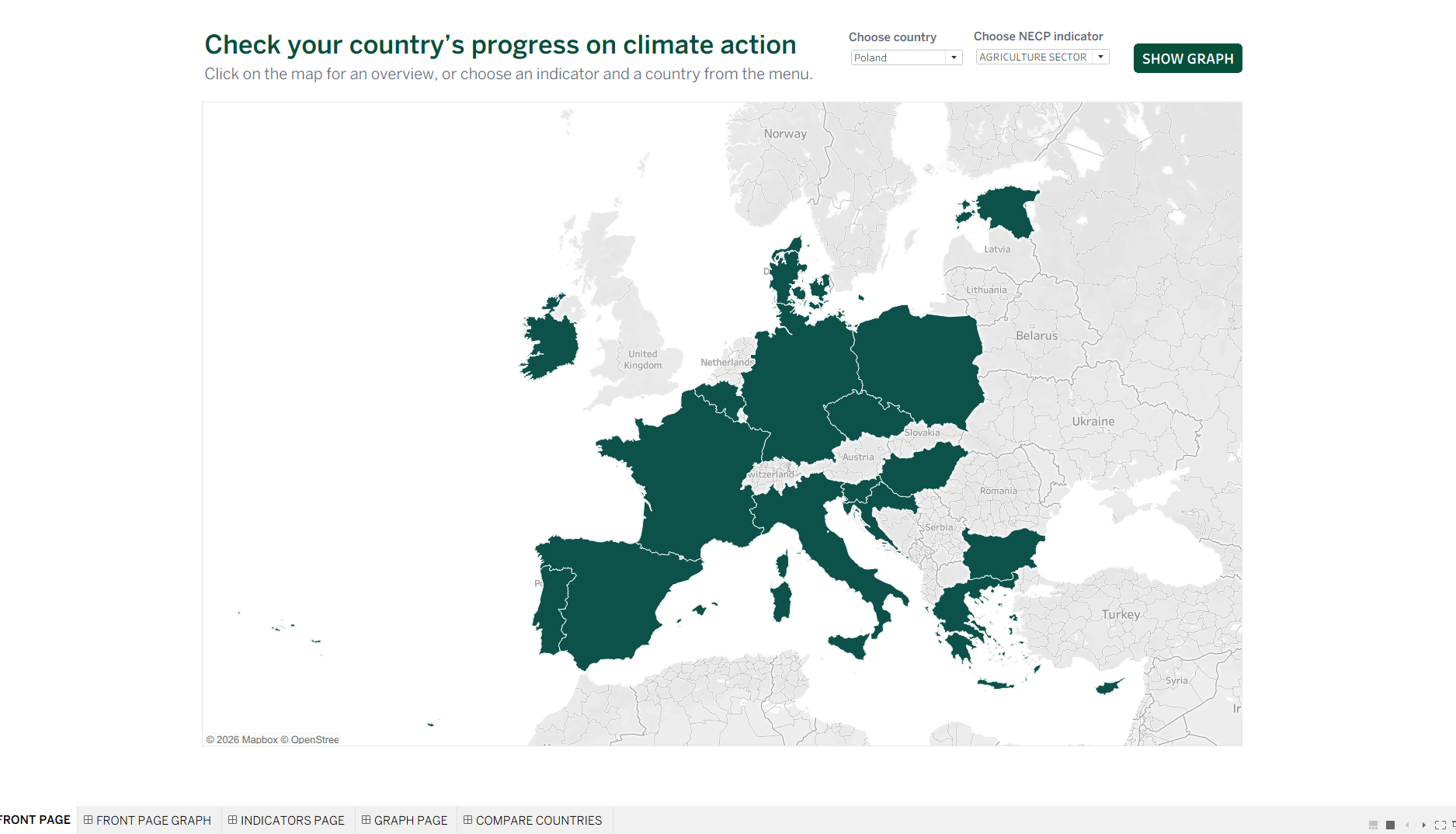
Original project screenshots. Select a report view and open it to explore the full image.
12 countries. One clearer view.
Climate & energy · Tableau · 12 countries
TECHNOLOGY & CAPABILITIESLess manual data handling. Simpler future updates. Easier country comparisons.
BEFORE
Separate files. Too many workarounds.
Country-level climate and energy indicators were spread across separate Excel files. The existing workbook relied on complex workarounds, making comparisons and future updates harder to maintain.
WHAT WE CHANGED
Consistent data. Clear navigation.
- Consolidate the country-level Excel files into one consistent data structure.
- Rework the workbook into a scalable Tableau dashboard with map-based navigation and dynamic indicators.
- Design country comparisons and social traffic-light assessments, with website-ready Tableau Public integration.
AFTER
A tool people can explore and maintain.
- Interactive map navigation across 12 European countries.
- Climate, energy and social indicator views.
- Side-by-side country comparisons and dynamic indicator selection.
- A consistent structure that reduced manual data handling and simplified future updates.
- A clearer, more maintainable dashboard ready for Tableau Public website integration.
The improvements are described qualitatively; quantified time or cost savings have not been published.
ONE USEFUL CONVERSATION
What’s slowing your
reporting down?
Leave with a clearer reporting bottleneck and a recommended next step.
Find your reporting bottleneck 30-minute fit call. No obligation.